适逢Android Studio迎来更新的日子,本人虽然一直使用IDEA写Android应用,但是Android Studio的新特性还是会融入到IDEA当中。虽说本次升级增加了一些性能工具,但是和DDMS比起来还是有不少的距离。
在之前的某个时候我例行更新SDK的时候发现多了一个Design Support的库,当时去看了下资料,虽然对Google Design的支持非常有限,但是官方提供的工具依旧令人欢欣鼓舞。无奈最近一直在从事定制应用的开发,对于通用Android应用特别是针对Material Design关注的也少了。同时真的是厌倦了在github上寻找第三方支持库,趁此时机简单总结一下Android Design Support Library。
当时Floating Action Button(以下简称FAB)随Goolge Design出来的时候真是非常夺人眼球。其抢眼的配色和相应的交互动画一度令人痴迷,随后结果就是官方只有一个Polymer有相关的实现,然后是十分激进的Google PlusAndroid版。相对较多的第三方实现也达到了不错的效果,对于与其的官方描述参见,Google Design的Buttons章节Buttons: Floating Action Button 。从我看到FAB开始我就在想这个东西到底怎么用,如果要融入到我应用的话,到底是什么场景。我现在觉得使用场景真的非常少,而且用起来很容易出现很多交互和逻辑上的错误,一点都不省心。这一点看官方文档的Do和Do not相关说明。
1
2
3
4
5
dependencies { compile fileTree (dir: 'libs' , include : ['*.jar' ]) compile 'com.android.support:appcompat-v7:23.0.1' compile 'com.android.support:design:23.0.1' }
首先是依赖关系问题,android.support.design.widget.FloatingActionButton在直接写在XML文件中时,源码中会去请求backgroundTint属性,这个属性来自AppCompat所以如果你没有使用appcompat主题会在运行时产生Failed to resolve attribute at index 6错误。这里索性全部按照Grandle生成的规范来,将所有的工具全部提升到23版本,也就是Android6.0对应的API版本。其中包括compileSdkVersion 23和buildToolsVersion "23.0.1"
1
2
3
4
5
6
7
8
9
10
11
12
/** * @author by min on 15/10/3. */ public class BaseActivity extends AppCompatActivity{ ... } ... <style name="AppTheme" parent="Theme.AppCompat.Light.DarkActionBar"> <!-- Customize your theme here. --> </style>
这里不得不说android.support.v7.app.ActionBarActivity这个非常直观的类已经过时,此时使用AppCompatActivity我想这个应该是和新的ToolBar思想格格不入的原因。主题也替换为AppCompat分类,这个使用IDEA的提示功能选一个相关的即可。而关于主题和配色问题我已经在《Android AppCompat v21 Theme》 一文有过描述,鉴于时间已经很久了,稍后会进行更新。
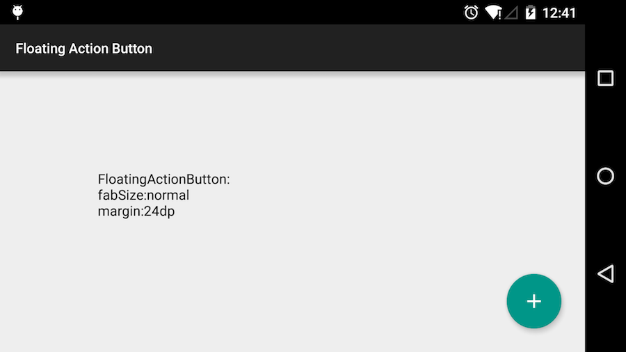
1 2 3 4 5 6 7 8 9 <android.support.design.widget.FloatingActionButton android:id ="@+id/fab" android:layout_width ="wrap_content" android:layout_height ="wrap_content" android:layout_gravity ="end|bottom" app:fabSize ="normal" android:layout_margin ="24dp" android:src ="@drawable/ic_add_white_48dp" />
效果如上图所示,图片资源来自之前谷歌公布的Material Design Icons库,包括Android、iOS相关规范大小的图片和一些svg资源。
FloatingActionButton
其继承自android.widget.ImageView,之前的ImageView:src属性如上面代码所示效果为中间的加号。同样可以使用ImageView#setImageDrawable(Drawable)进行修改,而之前说的在XML中使用的app:backgroundTint属性可以使用FloatingActionButton#setBackgroundTintList(ColorStateList)对FAB的各个状态进行控制。其默认颜色使用主题的colorAccent属性进行控制。
其他的一些实用方法如hide()、show()是非常直观的,而Ripple类的方法setRippleColor(int color)的说明是When running on devices with KitKat or below, we draw a fill rather than a ripple.5.0一下的版本就别想了。
结论 :意义不大,如果只想用这个的话自己写一个就是,没必要引入整个design lib。
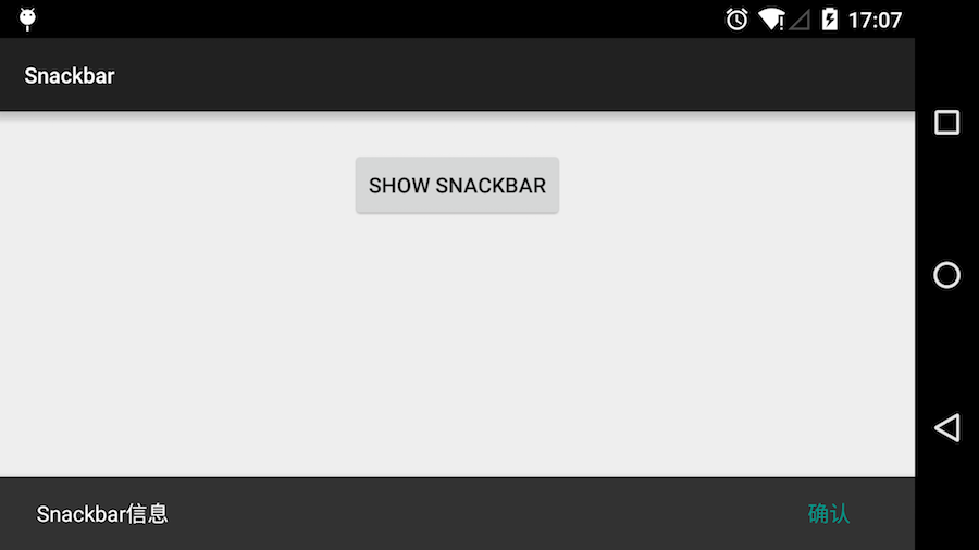
Snackbar Snackbar API(个人网站提供)。
Snackbar实际上是对已有的Toast进行强化,关于其设计规范详见Google Design Toast 章节。
Snackbars provide lightweight feedback about an operation.写的很清楚,直观的感受Snackbar和Toast最大的差别就是增加了反馈操作。关于这一点我想远在规范出现之前的Gmail移动端就有这个东西了,但是样式还有些所差别。
1 2 3 4 5 6 7 8 9 10 11 12 13 14 15 public class SnackBarActivity extends BaseActivity { ... Snackbar.make(view, R.string.snack_title, Snackbar.LENGTH_LONG) .setAction(R.string.snack_action_confirm, new View .OnClickListener() { @Override public void onClick (View view) { Toast.makeText(SnackBarActivity.this , R.string.toast_click, Toast.LENGTH_LONG).show(); } }).show(); }
如上图基本实用方式和Toast一致,多了一个#setAction(int, OnclickListener)方法,如果在超时时间到来之前出发Action操作,Snack将立刻消失。
1 2 3 4 5 6 7 8 9 10 11 12 13 14 15 16 17 18 19 20 21 22 23 24 public class SnackBarActivity extends BaseActivity implements View .OnClickListener{ ... Snackbar snackbar = Snackbar.make(view, R.string.snack_title, Snackbar.LENGTH_LONG); snackbar.setAction(R.string.snack_action_confirm, this ); snackbar.setAction(R.string.snack_action_undo, this ); snackbar.setAction(R.string.snack_action_dismiss, this ); snackbar.setActionTextColor(getResources().getColor(android.R.color.holo_red_light)); View backgroundView = snackbar.getView(); backgroundView.setBackgroundColor(Color.DKGRAY); TextView titleView = (TextView)backgroundView.findViewById(android.support.design.R.id.snackbar_text); titleView.setTextColor(getResources().getColor(android.R.color.holo_orange_dark)); snackbar.show(); ... @Override public void onClick (View view) { switch (view.getId()){ } } }
如图,真的如同命名一样setAction(int:resId, OnClickListener:l)是设置的意思而非追加,源码里也写的很清楚反馈的ActionView仅仅为一个Button对象,每次过来都是重设。因此目前一些逻辑复杂的功能也是不可能的,但是像一些undo操作还是很好用的。
TextInputLayout 我记得至少是一年以前,无意中看到Dribbble有人设计了一个表单。那只是一个普通的表单,在没有输入的时候只有文本框和其中的浅色的提示文字,但是输入之后提示文字上升到文本框的边框,配合上动画之后觉得非常优美。
这样的设计至少解决两个问题:1、文本框需要配一个标题,横向标题在竖屏状态下十分不协调,纵向的标题也是怎么看怎么难看,关键是标题完全是一次性的东西,对于内容稍多的表单更是灾难性的。2、如果酱标题当做提示文字,那么如果文本框内有文字时用户就不能确定当前文本框的到底是要输入什么,同样对于多内容的表单更是无力。几个月后国内出现了这个改表单的风潮,不可否认这种设计确实有他的优点,但是其最大的问题是和用户的直观感受不同(当然这仅仅是我个人看法)交互上普通用户很难接受,在加上排版布局的问题实际的效果更是大打折扣。也正因为如此这个设计在通用应用上昙花一现,不久后几乎都被还原的旧版。
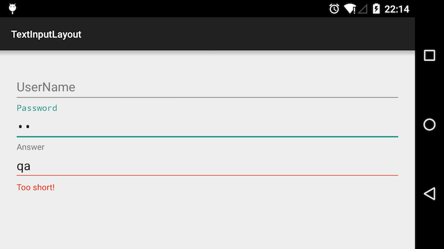
[TextInputLayout])(http://api.suwish.com/android/reference/android/support/design/widget/TextInputLayout.html)API(个人网站提供),同样的提供一种文本框,标题,提示的方案。其实这种方案无论是在网页还是桌面程序上的使用已经是非常的广泛和成熟了,官方的说法叫**Floating labels for editing text**。
1 2 3 4 5 6 7 8 9 <android.support.design.widget.TextInputLayout android:id ="@+id/input_answer" android:layout_width ="match_parent" android:layout_height ="wrap_content" > <EditText android:layout_width ="match_parent" android:layout_height ="wrap_content" /> </android.support.design.widget.TextInputLayout >
1
2
3
4
5
6
7
8
9
10
11
12
13
... final TextInputLayout answerLayout = (TextInputLayout)findViewById(R.id.input_answer);answerLayout.setHint("Answer" ); answerLayout.setError("Too short!" ); EditText editText = answerLayout.getEditText();editText.addTextChangedListener(new TextWatcher () { @Override public void beforeTextChanged (CharSequence charSequence, int i, int i1, int i2) { answerLayout.setErrorEnabled(charSequence.length() < 4 ); } ... }
如上XML文件和代码所示,总的来说功能非常简单。稍微看下源代码TextInputLayout就是一个LinearLayout,在覆盖掉addView(view, int, LayoutParams)方法后取得里面包裹的EditText。配一个标题栏和错误提示栏。但是不知道为什么很多属性直接写在XML文件中并不会起作用,如hint。
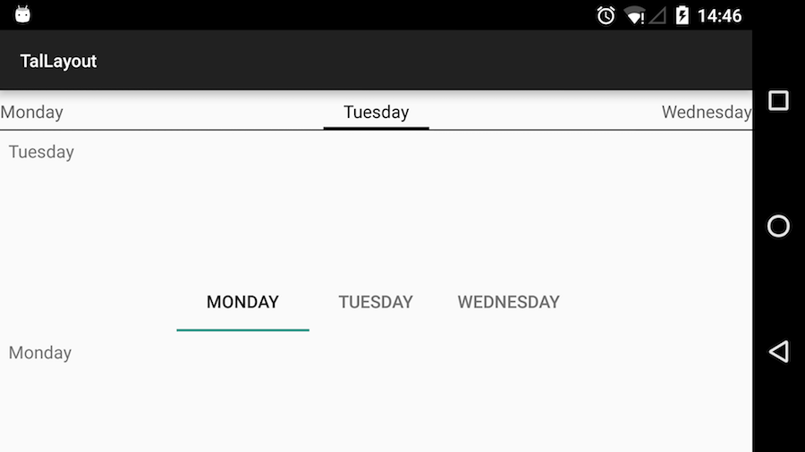
TabLayout TabLayout的表现形式就是滑动的Tab,这种形式不论是远古的TabHost还是Support v4的PagerTabStrip仅从外观上很难看出不同。首先是常用的PagerTabStrip。
1 2 3 4 5 6 7 8 9 10 11 12 13 <android.support.v4.view.ViewPager android:id ="@+id/view_pager" android:layout_width ="match_parent" android:layout_height ="match_parent" > <android.support.v4.view.PagerTabStrip android:id ="@+id/pager_title" android:layout_width ="match_parent" android:layout_height ="wrap_content" android:textColor ="@android:color/black" android:layout_gravity ="top" /> </android.support.v4.view.ViewPager >
view.PagerTabStrip和ViewPager是嵌套方式,嵌套好之后代码不需要过多控制,可以完全无视view.PagerTabStrip。
1 2 3 4 5 6 7 8 9 10 <android.support.design.widget.TabLayout android:id ="@+id/pager_title" android:layout_width ="match_parent" android:layout_height ="wrap_content" /> <android.support.v4.view.ViewPager android:id ="@+id/view_pager" android:layout_width ="match_parent" android:layout_height ="match_parent" />
从布局可以看出TabLayout和ViewPager仅仅在布局上是相邻关系,所以相互控制还需要代码进行设置。
1
2
3
4
5
6
7
8
9
10
11
12
private void buildStripView () { ViewPager viewPager = (ViewPager)findViewById(R.id.strip_pager); viewPager.setAdapter(new ViewAdapter (this )); } private void buildTabView () { TabLayout tabLayout = (TabLayout)findViewById(R.id.tab_title); ViewPager viewPager = (ViewPager)findViewById(R.id.tab_pager); viewPager.setAdapter(new ViewAdapter (this )); tabLayout.setupWithViewPager(viewPager); }
1
2
3
4
5
6
7
8
9
10
11
12
13
14
15
16
17
18
19
20
21
22
23
24
25
26
27
28
29
30
31
32
33
34
35
36
37
38
39
40
41
42
43
static class ViewAdapter extends PagerAdapter { private String[] titles; private TextView[] textViews; private Activity mActivity; public ViewAdapter (Activity activity) { mActivity = activity; titles = activity.getResources().getStringArray(R.array.pager_titles); textViews = new TextView [titles.length]; } @Override public int getCount () { return titles.length; } @Override public CharSequence getPageTitle (int position) { return titles[position]; } @Override public Object instantiateItem (ViewGroup container, int position) { String title = titles[position]; TextView textView = textViews[position]; if (textView == null ){ textView = new TextView (mActivity); textView.setPadding(20 , 20 , 20 , 20 ); textView.setText(title); textViews[position] = textView; } if (textView.getParent() == null ){ container.addView(textView); } return textView; } @Override public boolean isViewFromObject (View view, Object object) { return view == object; } @Override public void destroyItem (ViewGroup container, int position, Object object) { } }
如上图,结合两种方式之后上面为ViewPager+PagerTabStrip,下面为TabLayout+ViewPager的默认表现形式,如图反馈的bug一样PagerTabStrip在 api v23版本(当先系统版本为为Android 5.1,之后升级到Android6.0)下第一次进入PagerTabStrip表头不显示,在滑动一下后恢复正常。详见Issue 183127PagerTabStrip and PagerTitleStrip not showing titles on first display page ,升级请注意。
这里存在悲报,像之前的Context#getResource然后的getColor默认方式过时,新方法需要传入Theme。然后是PagerAdapter不知道从什么时候开始destroyItem方法变成了必须实现的方法,并且父类增加了UnsupportedOperationException,所以在使用中必须覆盖此方法同时不能习惯性地调用super.destroyItem(container, position, object)。
仅从效果上看实际上相差不大,通过一定的样式修改几乎能达到相同的效果,TabLayout新增了一些5.0开始的设计和交互效果。
NavigationView NavigationView是对DrawerLayout的补充。之前侧边列表(也可以说是抽屉)仅仅使用DrawerLayout管理边栏控件,而这个控件完全由自己实现,通常使用ListView之类的实现菜单。
1 2 3 4 5 6 7 8 9 10 11 12 13 14 15 16 17 18 19 20 <android.support.v4.widget.DrawerLayout xmlns:android ="http://schemas.android.com/apk/res/android" android:id ="@+id/drawer_layout" android:layout_width ="match_parent" android:layout_height ="match_parent" > <FrameLayout android:id ="@+id/content_frame" android:layout_width ="match_parent" android:layout_height ="match_parent" /> <ListView android:id ="@+id/left_drawer" android:layout_width ="240dp" android:layout_height ="match_parent" android:layout_gravity ="start" android:choiceMode ="singleChoice" android:divider ="@android:color/transparent" android:dividerHeight ="0dp" android:background ="#111" /> </android.support.v4.widget.DrawerLayout >
1
2
3
4
5
6
7
8
9
10
11
12
13
14
15
16
17
mDrawerToggle = new ActionBarDrawerToggle ( this , mDrawerLayout, R.drawable.ic_drawer, R.string.drawer_open, R.string.drawer_close ) { public void onDrawerClosed (View view) { getActionBar().setTitle(mTitle); invalidateOptionsMenu(); } public void onDrawerOpened (View drawerView) { getActionBar().setTitle(mDrawerTitle); invalidateOptionsMenu(); } }; mDrawerLayout.setDrawerListener(mDrawerToggle);
1
2
3
4
5
6
7
8
@Override public booleanonOptionsItemSelected (MenuItem item) { if (mDrawerToggle.onOptionsItemSelected(item)) { return true ; } return super .onOptionsItemSelected(item); }
这个相关图片目前各种应用和教程几乎都会提及,在此不做演示。对于抽屉其实现方式和Fragment相似,根据菜单跳转替换布局中的FrameLayout位置的元素。这种方法比较依赖Actionbar,我想这也是新版对其的升级吧。
NavigationView
如上图,两种情况,首先由于Actionbar部分有更加灵活的功能,这里使用新的Toolbar。正式因为要使用Toolbar,所以需要屏蔽Activity默认的Actionbar。
1 2 3 4 5 6 <style name ="AppNoActionBar" parent ="Theme.AppCompat.Light.NoActionBar" > <item name ="colorPrimary" > #673AB7</item > <item name ="colorPrimaryDark" > #512DA8</item > <item name ="colorAccent" > #FF4081</item > </style >
colorPrimary,为默认Toobar颜色,colorPrimaryDark为系统状态栏颜色,colorAccent为控件颜色。
1
2
3
4
5
6
7
8
9
10
11
12
13
14
15
16
17
18
19
20
21
22
23
24
25
26
27
28
29
30
31
32
33
34
35
36
37
38
39
40
41
42
43
44
45
46
47
public class NavigationActivity extends BaseActivity { private DrawerLayout mDrawerLayout; private NavigationView mNavigationView @Override protected void onCreate (Bundle savedInstanceState) { super .onCreate(savedInstanceState); setContentView(R.layout.activity_navigation_full); setupView(); } private void setupView () { mDrawerLayout = (DrawerLayout)findViewById(R.id.main_drawer); mNavigationView = (NavigationView)findViewById(R.id.main_navigation); Toolbar toolbar = (Toolbar)findViewById(R.id.toolbar); setSupportActionBar(toolbar); mNavigationView.setNavigationItemSelectedListener( new NavigationView .OnNavigationItemSelectedListener(){ @Override public boolean onNavigationItemSelected (MenuItem menuItem) { menuItem.setChecked(true ); mDrawerLayout.closeDrawers(); return true ; } }); } @Override public boolean onOptionsItemSelected (MenuItem item) { if (item.getItemId() == android.R.id.home) { mDrawerLayout.openDrawer(GravityCompat.START); return true ; } return super .onOptionsItemSelected(item); } @Override public void onBackPressed () { if (mDrawerLayout.isDrawerOpen(mNavigationView)){ mDrawerLayout.closeDrawers(); }else { super .onBackPressed(); } } }
基础的Activity,用法和之前的DrawerLayout几乎没有区别,使用Toolbal上的返回按钮你控制抽屉的展开。,上图左侧(使用图A表示)为抽屉在Toolbar下面,右侧(使用图B表示)抽屉在Toolbar上方覆盖掉Toolbar。在图A的情况下抽屉非全局状态,默认不会响应返回键onBackPressed ()此时需要进行判断,而在图B情况下由于抽屉是全局状态(简单说实际上是获得了焦点)可以响应返回键。使用NavigationView.OnNavigationItemSelectedListener来控制监听抽屉菜单项的点击事件,使用此方法可以对主界面容器进行切换。
1 2 3 4 5 6 7 8 9 10 11 12 13 14 15 16 17 18 19 20 21 22 23 24 25 26 27 28 29 30 31 32 33 34 35 36 <?xml version="1.0" encoding="utf-8" ?> <LinearLayout xmlns:android ="http://schemas.android.com/apk/res/android" xmlns:app ="http://schemas.android.com/apk/res-auto" android:layout_width ="match_parent" android:layout_height ="match_parent" android:orientation ="vertical" > <android.support.v7.widget.Toolbar android:id ="@+id/toolbar" android:layout_width ="match_parent" android:layout_height ="?attr/actionBarSize" android:background ="?attr/colorPrimary" app:navigationIcon ="@drawable/ic_menu_white_24dp" app:layout_scrollFlags ="scroll|enterAlways" app:popupTheme ="@style/ThemeOverlay.AppCompat.Light" /> <android.support.v4.widget.DrawerLayout android:id ="@+id/main_drawer" android:layout_width ="match_parent" android:layout_height ="match_parent" > <android.support.design.widget.NavigationView android:id ="@+id/main_navigation" android:layout_width ="wrap_content" android:layout_height ="match_parent" android:layout_gravity ="start" app:headerLayout ="@layout/navigation_header" app:menu ="@menu/menu_main" /> <FrameLayout android:id ="@+id/content_frame" android:layout_width ="match_parent" android:layout_height ="match_parent" > <TextView android:layout_width ="wrap_content" android:layout_height ="wrap_content" android:layout_gravity ="center" android:text ="Below toolbar" /> </FrameLayout > </android.support.v4.widget.DrawerLayout > </LinearLayout >
图A的模式,完全使用布局控制控制位置。
1
2
3
4
5
6
7
8
9
10
11
12
13
14
15
16
17
18
19
20
21
22
23
24
25
26
27
28
29
30
31
32
33
34
35
36
<?xml version="1.0" encoding="utf-8" ?> <android.support.v4.widget.DrawerLayout xmlns:android ="http://schemas.android.com/apk/res/android" xmlns:app ="http://schemas.android.com/apk/res-auto" android:id ="@+id/main_drawer" android:layout_width ="match_parent" android:layout_height ="match_parent" android:fitsSystemWindows ="true" > <LinearLayout android:layout_width ="match_parent" android:layout_height ="match_parent" android:orientation ="vertical" > <android.support.v7.widget.Toolbar android:id ="@+id/toolbar" android:layout_width ="match_parent" android:layout_height ="?attr/actionBarSize" android:background ="?attr/colorPrimary" app:navigationIcon ="@drawable/ic_menu_white_24dp" app:layout_scrollFlags ="scroll|enterAlways" app:popupTheme ="@style/ThemeOverlay.AppCompat.Light" /> <FrameLayout android:id ="@+id/content_frame" android:layout_width ="match_parent" android:layout_height ="match_parent" > <TextView android:layout_width ="wrap_content" android:layout_height ="wrap_content" android:layout_gravity ="center" android:text ="Full Content" /> </FrameLayout > </LinearLayout > <android.support.design.widget.NavigationView android:id ="@+id/main_navigation" android:layout_width ="wrap_content" android:layout_height ="match_parent" android:layout_gravity ="start" app:headerLayout ="@layout/navigation_header" app:menu ="@menu/menu_main" /> </android.support.v4.widget.DrawerLayout >
图B的覆盖模式,此时在DrawerLayout中增加android:fitsSystemWindows属性,使系统状态栏在界面之上,否则会被Toolbar会被覆盖。NavigationView中的app:headerLayout属性为设置抽屉的头部,也就是头像的部分,app:menu则使用菜单的方式生成一个类此与Listview的结构。
1 2 3 4 5 6 7 8 9 10 11 12 13 14 15 16 17 18 19 20 21 22 23 <LinearLayout xmlns:android ="http://schemas.android.com/apk/res/android" android:layout_width ="match_parent" android:layout_height ="match_parent" android:background ="?attr/colorPrimaryDark" android:gravity ="center" android:orientation ="vertical" android:padding ="16dp" android:theme ="@style/ThemeOverlay.AppCompat.Dark" > <ImageView android:layout_width ="100dp" android:layout_height ="100dp" android:layout_marginTop ="?attr/actionBarSize" android:background ="@drawable/avatar" /> <TextView android:layout_width ="match_parent" android:layout_height ="wrap_content" android:layout_marginTop ="16dp" android:gravity ="center" android:text ="Min" android:textAppearance ="@style/TextAppearance.AppCompat.Body1" android:textSize ="20sp" /> </LinearLayout >
抽屉此时需要注意的是两种情况下头部与顶端的距离,毕竟过少的话在图B情况下比较难看。
1 2 3 4 5 6 7 8 9 10 11 12 13 14 15 16 17 18 19 20 21 <menu xmlns:android ="http://schemas.android.com/apk/res/android" > <group android:checkableBehavior ="single" > <item android:title ="Account" android:icon ="@drawable/ic_account_circle_grey600_24dp" /> <item android:title ="Search" android:icon ="@drawable/ic_find_in_page_grey600_24dp" /> <item android:title ="Event" android:icon ="@drawable/ic_event_note_grey600_24dp" /> </group > <item android:title ="More" > <menu > <item android:title ="@string/action_settings" android:icon ="@drawable/ic_perm_data_setting_grey600_24dp" /> <item android:title ="@string/action_settings" android:icon ="@drawable/ic_extension_grey600_24dp" /> </menu > </item > </menu >
使用菜单会在抽屉主体部分生成一个类似于菜单的列表。在这里我不得不说,对于Android的DrawerLayout到目前为止我依旧不是很赞同使用,如果有其他的方式我也尽量不使用DrawerLayout。图A中抽屉在Toolbar之下,这时就需要处理汉堡条的问题,好在之前演示的很炫酷的汉堡条也已经有现成的实现。而两种方式在视觉上或者交互上到底哪种比较好呢,我作为一个开发者还真是不了解。尤其是在目前的环境中各种顶部导航加底部导航已经完全深入人心,在没有一个很好开放的团队的情况下,对于Android的设计开发者基本都没有多少话语权。进而导致谷歌的设计规范很难被推广。
AppBarLayout AppBarLayout其实单独使用意义不大,其主要的用处就是将Toolbar包裹起来进而可以执行更为高级的功能。由源码可知AppBarLayout实际上继承了LinearLayout,且为纵向布局。其更多时候和Coordinatorlayout配合使用,这一点在之后进行说明。
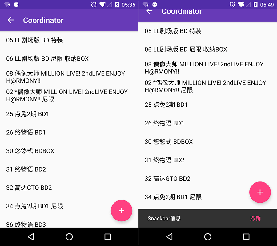
Coordinatorlayout Coordinatorlayout 是Design Library中相当重要的类,通过它可以实现Material Design中有些相当令人惊艳的交互效果。这其中需要和多个类相互配合使用,如AppBarLayout、TabLayout、CollapsingToolbarLayout、NestedScrollView等。
class Coordinatorlayout extends ViewGroup implements NestedScrollingParent,其中NestedScrollingParent提供了NestedScrolling新的嵌套滑动机制。关于这点之后需要另外的文来说明,这里进行简要的说明。
1
2
3
4
5
6
dependencies { compile fileTree (dir: 'libs' , include : ['*.jar' ]) compile 'com.android.support:appcompat-v7:23.0.1' compile 'com.android.support:recyclerview-v7:23.0.1' compile 'com.android.support:design:23.0.1' }
由于需要滚动元素,这里增加对RecyclerView的依赖,实现一个组基本的动态隐藏Toolbar的功能。
1 2 3 4 5 6 7 8 9 10 11 12 13 14 15 16 17 18 19 20 21 22 23 24 25 26 27 28 29 30 31 32 33 34 35 36 <android.support.design.widget.CoordinatorLayout xmlns:android ="http://schemas.android.com/apk/res/android" xmlns:app ="http://schemas.android.com/apk/res-auto" android:layout_width ="match_parent" android:layout_height ="match_parent" android:fitsSystemWindows ="true" > <android.support.design.widget.AppBarLayout android:id ="@+id/appbar" android:layout_width ="match_parent" android:layout_height ="wrap_content" android:fitsSystemWindows ="true" android:theme ="@style/ThemeOverlay.AppCompat.Dark.ActionBar" > <android.support.v7.widget.Toolbar android:id ="@+id/toolbar" android:layout_width ="match_parent" android:layout_height ="?attr/actionBarSize" app:navigationIcon ="@drawable/ic_arrow_back_white_24dp" app:layout_scrollFlags ="scroll|enterAlways" /> </android.support.design.widget.AppBarLayout > <android.support.v7.widget.RecyclerView android:id ="@+id/list" android:layout_width ="match_parent" android:layout_height ="match_parent" app:layout_behavior ="@string/appbar_scrolling_view_behavior" /> <android.support.design.widget.FloatingActionButton android:layout_width ="wrap_content" android:layout_height ="wrap_content" android:layout_gravity ="bottom|right" android:layout_margin ="16dp" android:src ="@drawable/ic_add_white_48dp" app:layout_anchor ="@id/list" app:layout_anchorGravity ="bottom|right|end" /> </android.support.design.widget.CoordinatorLayout >
没有过多的额外代码,这里根布局使用CoordinatorLayout,简单的理解为FrameLayout。然后使用AppBarLayout对Toolbar进行包装,可滚动元素使用RecyclerView并增加app:layout_behavior属性值为@string/appbar_scrolling_view_behavior。这里的值为定义在desgin类库中,值为android.support.design.widget.AppBarLayout$ScrollingViewBehavior。而layout_behavior属性是来自CoordinatorLayout,所以其位置可以卸载CoordinatorLayout的尖括号内没有也可以写在子元素的尖括号内,其指定的为一个CoordinatorLayout实使用的Behavior元素。
Behavior也是Design库中的亮点,接下来进行简单描述,详细内容另起一文。FloatingActionButton中的anchor属性可以达到如右图所示的效果,当界面上移时自动上移。
1
2
3
4
5
6
7
8
9
10
11
12
13
14
15
16
17
18
19
20
21
22
23
24
25
26
27
28
29
30
31
32
public class CoordinatorActivity extends BaseActivity implements View .OnClickListener{ private RecyclerView recyclerView; @Override protected void onCreate (Bundle savedInstanceState) { super .onCreate(savedInstanceState); setContentView(R.layout.activity_coordinator); setupView(); } private void setupView () { Toolbar toolbar = (Toolbar)findViewById(R.id.toolbar); setSupportActionBar(toolbar); recyclerView = (RecyclerView)findViewById(R.id.list); recyclerView.setLayoutManager(new LinearLayoutManager (this )); recyclerView.setAdapter(new SampleAdapter (this )); findViewById(R.id.fab).setOnClickListener(this ); } @Override public void onClick (View view) { switch (view.getId()){ case R.id.fab: Snackbar.make(view, R.string.snack_title, Snackbar.LENGTH_LONG) .setAction(R.string.snack_action_undo, this ).show(); break ; } } }
代码中几乎没有体现出任何不同。
1
2
3
4
5
6
7
8
9
10
11
12
13
14
15
16
17
18
19
20
21
22
23
24
25
26
27
28
29
30
31
32
33
34
public class SampleAdapter extends RecyclerView .Adapter<RecyclerView.ViewHolder>{ private String[] dataSource = null ; public SampleAdapter (Context context) { dataSource = context.getResources().getStringArray(R.array.list_data); } @Override public RecyclerView.ViewHolder onCreateViewHolder (ViewGroup parent, int viewType) { View view = LayoutInflater.from(parent.getContext()). inflate(android.R.layout.simple_list_item_1, null ); return new SampleHolder (view); } @Override public void onBindViewHolder (RecyclerView.ViewHolder holder, int position) { String text = dataSource[position]; SampleHolder textHolder = (SampleHolder)holder; textHolder.textView.setText(text); } @Override public int getItemCount () { return dataSource.length; } class SampleHolder extends RecyclerView .ViewHolder{ TextView textView; public SampleHolder (View itemView) { super (itemView); textView = (TextView) itemView.findViewById(android.R.id.text1); } } }
一个非常简单的RecyclerView适配器,连基本的效果也没有,在之后会进行复用。同时新的RecyclerView实现了v4中的NestedScrollingChild接口。新的嵌套滑动机制包括几个重要的接口
NestedScrollingChild
NestedScrollingParent
NestedScrollingChildHelper
NestedScrollingParentHelper
简单来说就是子类在获得Touch事件并处理之后会和父容器在偏移量上进行交换,这样父类可以根据子类的滚动做出自己的操作,如控件的相对位移等等。而具体是布局上的处理则由Behavior来处理。
1 2 3 4 5 6 7 8 public abstract static class Behavior <V extends View >... @Retention(RetentionPolicy.RUNTIME) public @interface DefaultBehavior { Class<? extends CoordinatorLayout .Behavior> value(); }
在CoordinatorLayout类中有一个抽象的Behavior实现和一个DefaultBehavior注解。
1 2 class ViewOffsetBehavior <V extends View > extends Behavior <V>
在包android.support.design.widget存在一个位控件偏移操作定制的Behavior.
1 2 3 4 5 6 7 8 9 10 11 @DefaultBehavior(AppBarLayout.Behavior.class) public class AppBarLayout extends LinearLayout { .... public static class ScrollingViewBehavior extends ViewOffsetBehavior <View> ... public static class Behavior extends ViewOffsetBehavior <AppBarLayout> ... }
本例子中嵌套滑动的AppBarLayout默认使用了注解并指向内部类Behavior。通过这个途径当父容器获得子容器滑动偏移后根据子容器的Behavior控制其相对移动。这里进行简要描述,具体的实现方式之后专门进行说明。
1
2
3
4
5
6
7
8
9
10
11
12
13
14
15
16
17
18
public class CoordinatorLayout extends ViewGroup implements NestedScrollingParent { ... static final ThreadLocal<Map<String, Constructor<CoordinatorLayout.Behavior>>> sConstructors; ... public static class LayoutParams extends MarginLayoutParams { ... LayoutParams(Context context, AttributeSet attrs) { ... this .mBehavior = CoordinatorLayout.parseBehavior(context, attrs, a.getString(styleable.CoordinatorLayout_LayoutParams_layout_behavior)); } } ... static CoordinatorLayout.Behavior parseBehavior (Context context, AttributeSet attrs, String name) { ... } }
在CoordinatorLayout的内部类LayoutParams中将app:layout_behavior属性的值作为转换为一个类的构造器并存储在全局变量sConstructors中。父类在布局的时候会访问声明的Behavior,而对应的Bbehavior则会查找到自己要处理的View并计算onMeasureChild和偏移量等。由CoordinatorLayout 的LayoutParams可知xml声明的Behavior影响到具体子类中注解,因此app:layout_behavior不要声明在AppBarLayout中。
而做一下想之前谷歌演示的界面,主要就是自定义Behavior处理嵌套滚动,实现起来也是相当轻松的(这点之后专门进行说明)。
总之
仅仅是改样式的话Design库确实使用价值不大,但是有CoordinatorLayout的存在,贴别是其带来的新的布局思路真的非常值得我们学习。


